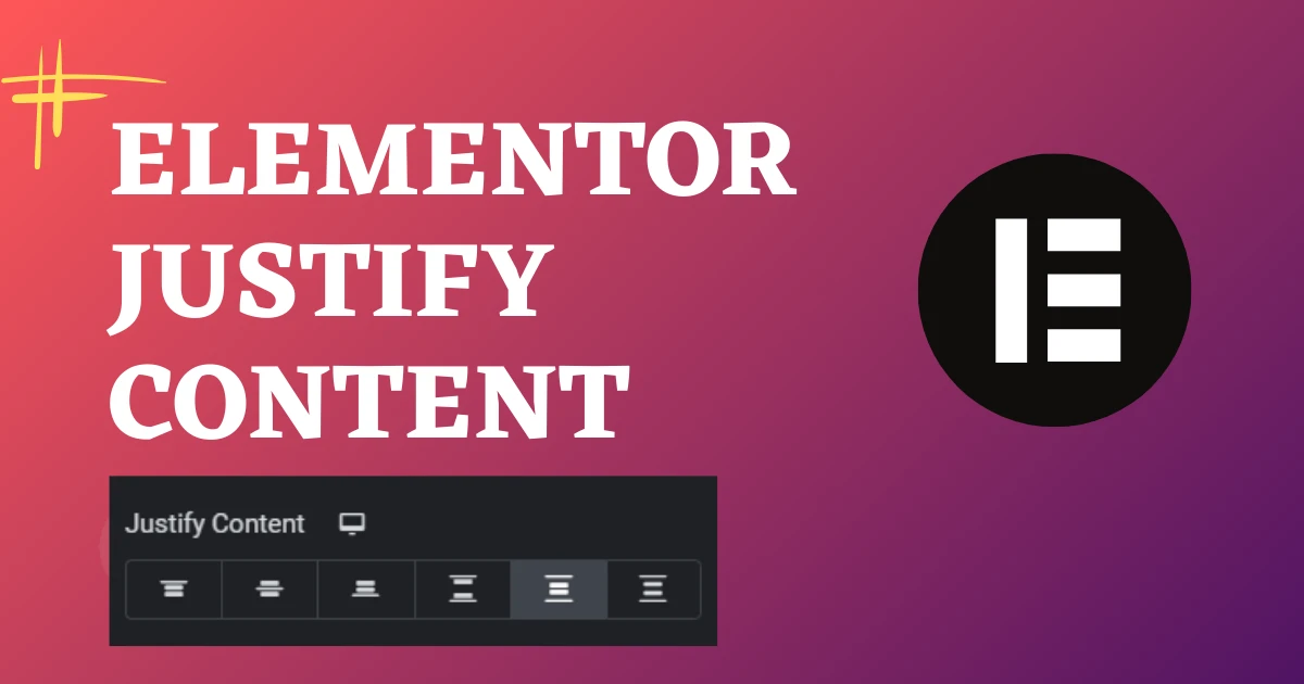
In Elementor’s Flexbox Container engine, Justify Content controls how child items are distributed along the container’s Main Axis (horizontal in Row direction, vertical in Column direction). The six core options are: (1) Start (aligns items to the beginning), (2) Center (centers items), (3) End (pushes items to the edge), (4) Space Between (pushes outer items to boundaries and spaces inner items evenly), (5) Space Around (adds equal spacing around each item), and (6) Space Evenly (creates perfectly identical gaps across all items and borders).
Key Takeaways
- Justify Content controls element alignment along the main axis of a Flexbox container.
- Key options: Flex Start, Center, Flex End, Space Between, Space Around, and Space Evenly.
- Space Between is ideal for headers, separating logo on the left from navigation on the right.
- Pair Justify Content with Align Items (cross axis) for flawless responsive layouts on all devices.
Introduction
Elementor has become a game-changer in the world of WordPress page builders, offering an intuitive and flexible platform for designing stunning websites without the need for coding. One of the key features that contribute to its versatility is the Elementor Justify Content property. In this blog post, we’ll delve into the intricacies of Elementor’s Container element and explore how you can leverage its “Justify Content” option to enhance the layout and design of your website.
Understanding Elementor Containers
Before we dive into the specifics of “Justify Content,” let’s briefly understand what Elementor Containers are and how they contribute to the overall structure of your web pages.
What is an Elementor Container? In Elementor, a Container is a fundamental building block that allows you to organize and structure your content. It serves as a wrapper for other elements, providing a customizable space where you can arrange and style your content elements.
The Power of Elementor Justify Content
The “Justify Content” property is a powerful tool within the Elementor Container settings that enables you to control the alignment of the content within the container. This can significantly impact the visual appeal and user experience of your website.
How to Access “Justify Content” in Elementor
- Open the page you are editing with Elementor.
- Locate the Container element you want to adjust.
- Click on the Container to reveal the left-side panel.
- Navigate to the “Layout” tab.
- Look for the “Justify Content” option.
Exploring Elementor Justify Content Options:
Elementor provides several “Justify Content” options, each serving a unique purpose in terms of content alignment. Let’s explore some of the commonly used options:
Justify Content Start
This aligns the content to the start of the container. It’s ideal for a left-aligned layout.

Justify Content Center
Centering the content within the container creates a balanced and visually appealing design.

Justify Content End
Aligns the content to the end of the container, suitable for a right-aligned layout.

Justify Content Space Between
This option evenly distributes the content with space between each element.

Justify Content Space Around
Similar to “Space Between,” but also adds equal space at the beginning and end.

Justify Content Space Evenly
Distributes the space evenly between and around the content elements.

Practical Examples:
Example 1: Centering a Hero Section
- Design your hero section within a full-width Container.
- Set “Justify Content” to “Center” for a visually centered hero layout.
Conclusion:
Mastering the “Justify Content” property in Elementor Containers opens up a world of design possibilities for your WordPress website. Experiment with different options to find the alignment that best suits your content and enhances the overall aesthetics of your pages. With Elementor’s intuitive interface and powerful features, you have the tools at your fingertips to create visually stunning and user-friendly websites.
Main Axis vs Cross Axis: The Flexbox Fundamentals
To master Elementor Justify Content, you must understand how direction dictates the main axis:
- When Direction is ROW (Horizontal): The Main Axis runs horizontally from left to right.
Justify Contentcontrols horizontal positioning, whileAlign Itemscontrols vertical cross-axis alignment. - When Direction is COLUMN (Vertical): The Main Axis runs vertically from top to bottom.
Justify Contentcontrols vertical positioning, whileAlign Itemscontrols horizontal cross-axis alignment.
Visualizing the 6 Justify Content Options
| Justify Content Value | Behavior (Row Direction) | Best Used For |
|---|---|---|
| Start | Packs items tightly to the left edge | Tag clusters, category badges, author metadata. |
| Center | Centers items along the middle of container | Hero CTA button groups, centered headline groupings, social icons. |
| End | Packs items to the right boundary | Header phone numbers, right-aligned CTA buttons. |
| Space Between | First item flush left, last item flush right, gap in middle | Navigation bars (Logo on left, Menu on right), card headers. |
| Space Around | Items have equal space around them (half-size space at edges) | Sponsor logo bars, feature icon rows. |
| Space Evenly | Identical space between every item and outer container walls | Evenly spaced metric counters, stat highlights, multi-column cards. |
Responsive Override Patterns: Desktop Row to Mobile Column
On desktop, setting Direction: Row with Justify Content: Space Between keeps your logo on the left and CTA button on the right. When switching to mobile, change Direction: Column and set Justify Content: Center with Align Items: Center to produce an elegant, perfectly centered vertical mobile header.
Need custom front-end architecture, CSS Flexbox mastering, or bespoke WordPress development? Explore our WordPress development solutions at CV World.
CSS Flexbox Alignment Recipes for Common Web Components
| Component | Direction | Justify Content | Align Items |
|---|---|---|---|
| Site Navigation Bar | Row | Space Between | Center |
| Centered Hero CTA Box | Column | Center | Center |
| Equal-Height Pricing Cards | Column | Space Between | Stretch |
Frequently Asked Questions
Ready to Build Professional Websites Faster?
Supercharge your WordPress design workflow with 100+ premium widgets, theme builder capabilities, and dynamic WooCommerce templates.
Justify Content aligns items along the Main Axis (the direction the items flow). Align Items aligns items along the perpendicular Cross Axis.
Justify Content requires space to distribute. If container items already fill 100% of available width or height, justify content will produce no visible change until the container expands or item sizes shrink.
Yes. The Gap control in Elementor defines an exact pixel distance (e.g. 24px) between child items, giving you precise spacing control regardless of container width.
Yes. Flexbox Containers completely replace legacy sections, reducing DOM tree depth by up to 70% and drastically boosting mobile PageSpeed scores.
No. When implemented using modern clean-code standards, responsive Flexbox containers, and server-side caching, your website maintains rapid sub-second loading speeds and easily passes Google Core Web Vitals assessments.
No. We build every layout using intuitive drag-and-drop visual controls and custom fields, allowing content managers to update text, replace images, and publish new pages without touching code.
We recommend managed high-speed hosting with LiteSpeed web server technology (such as Hostinger Cloud or Cloudways) with Redis object caching and automated daily backups.
Yes. Full responsive breakpoint controls allow you to adjust spacing, font sizes, column ordering, and element visibility independently for each screen size.
[
Ready to Build Something Great?
Connect with CV World lead engineers on WhatsApp for a fast, fixed quote and zero obligation.