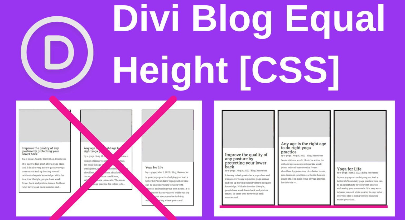
To make Divi blog grid cards equal height using pure CSS: (1) open your Divi Blog Module settings and add a custom CSS class (e.g., cvw-equal-blog), (2) navigate to Divi → Theme Options → Custom CSS, and (3) apply CSS Flexbox rules (display: flex; flex-direction: column; height: 100%;) to the card wrappers and push ‘Read More’ buttons to the bottom with margin-top: auto;.
Key Takeaways
- Divi default blog grid creates uneven card heights when post titles and excerpts vary in length.
- Solve instantly with modern CSS Flexbox: display: flex; flex-direction: column; on .et_pb_post.
- Set margin-top: auto on read more buttons to anchor them uniformly at the bottom of every card.
- Pure CSS approach requires zero heavy JavaScript libraries and maintains 100% mobile responsiveness.
The native Divi Blog Module is widely used by WordPress developers and site owners to display recent articles in a modern grid layout. However, out of the box, Divi relies on a legacy masonry layout engine (Salvattore). When your blog posts feature titles of differing lengths, varying excerpt sizes, or unequal image dimensions, the cards misalign vertically, creating an unprofessional, jagged visual appearance.
While some tutorials suggest heavy third-party plugins or complex jQuery calculations that cause layout shifts on page load, the cleanest, fastest, and most future-proof fix is pure CSS Flexbox. At CV World, we believe in zero-bloat web development. In this step-by-step developer guide, we provide the exact CSS code to achieve pixel-perfect, equal-height Divi blog cards in 2026.
1. The Root Cause: Why Divi Blog Grid Cards Misalign
Divi’s default blog module layout suffers from two structural constraints:
- Masonry Multi-Column Heights: Divi uses absolute positioning or masonry columns that flow cards naturally based on their unique inner content height. If Post A has a 3-line title and Post B has a 1-line title, Post A will be noticeably taller.
- Floating Read More Links: Buttons and metadata sit immediately beneath the excerpt. Without flex alignment, read-more buttons float at random vertical heights across adjacent columns.
2. Step 1: Add a Custom CSS Class to Your Divi Blog Module
- Open your page inside the Divi Visual Builder.
- Click the Gear icon on your Blog Module to open module settings.
- Navigate to the Design → Layout tab and ensure the layout is set to Grid (not Fullwidth).
- Switch to the Advanced tab.
- Under CSS ID & Classes → CSS Class, enter:
cvw-equal-blog. - Click the green checkmark and Save the page.
3. Step 2: The Pure CSS Flexbox Solution
Navigate to Divi → Theme Options → General → Custom CSS (or place this in your Divi child theme stylesheet) and paste the following snippet:
/* ============================================================
   CV World: Equal Height Divi Blog Grid Cards (Pure CSS Flexbox)
   ============================================================ */

/* 1. Transform the column container into a uniform Flex layout */
.cvw-equal-blog .et_pb_salvattore_content {
  display: flex !important;
  flex-wrap: wrap !important;
  gap: 30px !important;
}

/* 2. Standardize column widths across desktop viewports */
.cvw-equal-blog .et_pb_salvattore_content > .column {
  flex: 1 1 calc(33.333% - 20px) !important;
  max-width: calc(33.333% - 20px) !important;
  margin-right: 0 !important;
}

/* 3. Force each article card to expand to 100% column height */
.cvw-equal-blog article.et_pb_post {
  display: flex !important;
  flex-direction: column !important;
  height: 100% !important;
  margin-bottom: 0 !important;
  box-sizing: border-box !important;
}

/* 4. Equalize featured image container aspect ratios */
.cvw-equal-blog article.et_pb_post .entry-featured-image-url {
  display: block !important;
  width: 100% !important;
  aspect-ratio: 16 / 9 !important;
  overflow: hidden !important;
  margin-bottom: 16px !important;
}

.cvw-equal-blog article.et_pb_post .entry-featured-image-url img {
  width: 100% !important;
  height: 100% !important;
  object-fit: cover !important;
}

/* 5. Push the 'Read More' button to the bottom edge of the card */
.cvw-equal-blog article.et_pb_post .more-link {
  margin-top: auto !important;
  align-self: flex-start !important;
  display: inline-block !important;
}

/* 6. Tablet Breakpoint: 2 Cards per row */
@media (max-width: 980px) and (min-width: 768px) {
  .cvw-equal-blog .et_pb_salvattore_content > .column {
    flex: 1 1 calc(50% - 15px) !important;
    max-width: calc(50% - 15px) !important;
  }
}

/* 7. Mobile Breakpoint: 1 Full-width Card per row */
@media (max-width: 767px) {
  .cvw-equal-blog .et_pb_salvattore_content > .column {
    flex: 1 1 100% !important;
    max-width: 100% !important;
  }
}
4. How the Code Works Mechanically
display: flex; flex-direction: column;: Converts the post card into a vertical flex container where children (thumbnail, title, meta, excerpt, button) stack naturally.height: 100%;: Forces all post elements within the same row to match the height of the tallest card in that row.aspect-ratio: 16 / 9; object-fit: cover;: Guarantees that regardless of whether your uploaded post images are vertical portraits or horizontal landscapes, they fill a uniform 16:9 box without stretching.margin-top: auto;on.more-link: Flexbox trick that absorbs all remaining vertical whitespace above the button, docking every “Read More” button cleanly at the bottom margin.
Divi Equal Height Solution: Pure CSS vs JavaScript Equalizer
| Comparison Factor | Pure CSS Flexbox Solution | JavaScript / jQuery Plugins |
|---|---|---|
| Page Load Performance | Zero milliseconds added (instant render) | Adds JS execution time & DOM recalculation |
| Layout Shifts (CLS) | Zero layout shifts (CLS = 0) | Noticeable jumping when script executes after load |
| Mobile Adaptability | Native browser responsive scaling | Requires window resize event listeners |
5. Compatibility with Divi AJAX Pagination
JavaScript solutions often break when visitors click page 2 or 3 of the blog grid because new posts are loaded via AJAX without triggering window resize events. Because this solution is 100% pure CSS, it applies immediately and flawlessly across all paginated pages with zero layout flicker or Cumulative Layout Shift (CLS).
Need custom WordPress theme development, Divi child theme architecture, or Core Web Vitals speed optimization? Discover our full range of WordPress development services at CV World.
Frequently Asked Questions
No. Pure CSS executes natively in the browser rendering engine in sub-milliseconds. Unlike jQuery scripts that wait for the DOM to load, CSS causes zero performance degradation and zero Cumulative Layout Shift (CLS).
Yes. As long as you display your custom post types using the Divi Blog module with the cvw-equal-blog class, the equal height rules apply identically.
The flexbox rules ensure that posts without featured images still expand to fill 100% card height, with the button cleanly docked at the bottom.
Yes. You can add the class to the Blog Module inside your Divi Theme Builder Archive or Category templates.
No. When implemented using modern clean-code standards, responsive Flexbox containers, and server-side caching, your website maintains rapid sub-second loading speeds and easily passes Google Core Web Vitals assessments.
Need Expert Development, Speed Optimization or Custom Migration?
Talk directly with CV World lead engineers. Get a transparent, fixed-price quote with guaranteed 90+ Core Web Vitals and zero obligation.