Understanding Elementor Container Directions
Elementor Pro is a powerful page builder for WordPress, offering an intuitive drag-and-drop interface that allows users to create beautiful, responsive websites without coding. One of its standout features is the Elementor Container Directions, which provides flexibility and more control over the layout of a page. The Container widget is particularly useful in the modern web design process because it makes building responsive and dynamic layouts easier, especially for those who want to utilize the power of Flexbox with Elementor Container Directions.
The Container Directions are an essential part of Elementor’s layout system. This article will delve deeply into the different directions available for containers in Elementor Pro, explaining their function, importance, and best use cases for achieving modern, responsive designs.
What Are Containers in Elementor Pro?
Before diving into the directions, it’s important to understand what containers are and how they fit into the Elementor Pro framework. A container in Elementor Pro is a versatile layout structure that allows you to group various widgets, sections, and columns. This tool offers a much more streamlined approach than traditional sections and columns, as it utilizes the Flexbox layout model.
Flexbox, short for Flexible Box Layout, is a layout model that allows for more predictable and fluid layouts. It works by distributing space across items in a container and making it easy to align them dynamically. In the context of Elementor, containers act as Flexbox containers, where you can control the layout direction, alignment, and spacing of the child elements inside them.
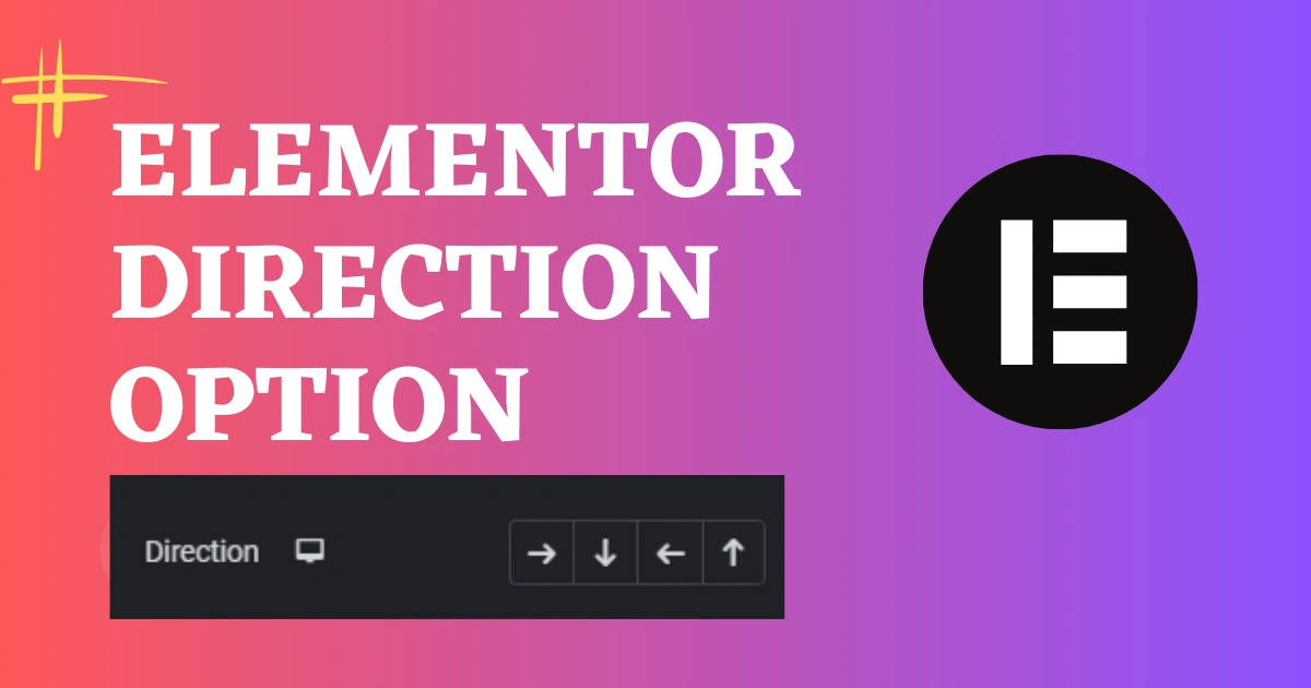
The Container Directions control the flow of these elements within the container, determining whether the elements will be aligned horizontally, vertically, or in reverse.
Types of Elementor Pro Container Directions
In Elementor Pro, containers provide three primary layout directions:
- Row Direction (Horizontal Layout)
- Column Direction (Vertical Layout)
- Reverse Directions (Reverse Row and Reverse Column)
These directions allow you to control the alignment and flow of content within the container. Understanding when and how to use these directions is critical for building responsive and visually appealing websites.
1. Row Direction (Horizontal Layout)
Overview of Row Direction:
The Row Direction is the default layout for most containers in Elementor. When you choose the Row direction, the child elements inside the container are laid out horizontally, one beside the other, from left to right. This type of layout is ideal when you want elements to be aligned in a line horizontally, such as images, buttons, or text.
How to Set Row Direction:
To apply the row direction to a container in Elementor, simply open the Container Settings, navigate to the Layout section, and set the Direction to Row. This is the default setting, so if no direction is explicitly set, the container will behave as if it is in Row direction.

Use Cases for Row Direction:
- Navigation Bars: You can use row direction to display a horizontal navigation bar where menu items are arranged side by side.
- Hero Sections: Many websites use a row direction for hero sections, where text and buttons are placed next to an image or video background.
- Feature Layouts: A row layout is ideal for feature sections where icons and text descriptions are placed horizontally across the screen.
Benefits of Row Direction:
- Simplicity: It’s easy to manage and use, as it’s the most common direction for layouts.
- Familiarity: Row direction is what most web designers are used to when thinking about a horizontal layout.
- Ideal for Small Elements: If you have multiple small elements like buttons or icons that need to appear in a row, this direction is perfect.
2. Column Direction (Vertical Layout)
Overview of Column Direction:
In Column Direction, the elements inside the container will be arranged vertically, one under the other. This is the classic approach to creating content that flows down the page, such as blog posts, contact forms, and text-heavy sections.How to Set Column Direction:To set a container to use a column direction, go to the Container Settings and in the Layout section, choose Column from the Direction dropdown. The container will automatically stack elements vertically.

Use Cases for Column Direction:
- Blog Pages: A column layout is perfect for a blog or news page where articles need to appear in a vertical stack.
- Forms: Contact forms or registration forms often use column direction, as the form fields need to be stacked on top of each other.
- Single-Page Websites: On a single-page website, a column layout will allow sections like About Us, Contact, and Testimonials to appear one after the other.
Benefits of Column Direction:
- Natural Flow: A column layout often feels more natural when dealing with text-heavy content or forms, as people are used to scrolling vertically.
- Clean and Organized: It’s an efficient way of arranging content when the goal is simplicity and structure.
- Great for Long-Form Content: Ideal for pages that require readers to scroll, like blogs or portfolios.
3. Reverse Directions (Reverse Row and Reverse Column)
Overview of Reverse Row Direction:
The Reverse Row Direction allows you to reverse the horizontal layout, meaning elements inside the container will be aligned from right to left instead of the standard left to right. This is especially useful when designing for right-to-left (RTL) languages, such as Arabic or Hebrew.
How to Set Reverse Row Direction:
In the Container Settings, select Row as the direction, and then enable Reverse Row in the Layout section. This will cause the child elements to be arranged from right to left.

Use Cases for Reverse Row Direction:
- RTL Languages: For websites that need to support languages like Arabic or Hebrew, reversing the row direction ensures that the content aligns properly for native speakers.
- Custom Layouts: Sometimes, you may want to create a specific visual effect, such as having a background image appear first and text appearing last. The reverse row layout can help achieve this.
Overview of Reverse Column Direction:
Similarly, the Reverse Column Direction will stack elements in a bottom-to-top manner instead of the standard top-to-bottom alignment. This can be useful in certain design contexts or layouts.
How to Set Reverse Column Direction:
Select Column as the direction and then enable Reverse Column in the Layout section of the container settings. This will reverse the order of the items inside the container.

Use Cases for Reverse Column Direction:
- Unique Design Effects: If you want to create a visual effect where the content stacks in an unconventional manner (for instance, a footer that grows from the bottom), reverse column direction can help.
- RTL Support: Just like the reverse row, reverse column can also be helpful for designing RTL layouts.
Why Elementor Container Directions Are Important for Web Design
Flexibility and Control:
One of the greatest strengths of Elementor Pro is its flexibility. By controlling the direction of containers, you can create a wide range of designs and layouts to fit any purpose. The ability to change direction easily lets you build complex designs that are responsive to different screen sizes, making the content more user-friendly.
Responsive Design:
Responsive design ensures that your website is optimized for mobile devices, tablets, and desktops. Using different container directions helps to adapt your content to various screen sizes. For example, you might want to have a row layout on a desktop but switch to a column layout on mobile devices for better readability and user experience. Elementor allows you to adjust container directions for each device, ensuring your website always looks great.
Improved User Experience (UX):
The right container direction leads to better user experience by making content easier to read, navigate, and interact with. For instance, a row layout might be better suited for a website menu, while a column layout could make text-heavy content more digestible. The right combination of direction and spacing makes sure your design is not only functional but also aesthetically pleasing.
Best Practices for Using Container Directions in Elementor Pro
- Maintain Consistency: While flexibility is key, it’s important to maintain a consistent design throughout your site. Overuse of reverse directions or switching directions too frequently can confuse users and negatively impact navigation. Try to create a cohesive layout pattern that aligns with the overall design of the website.
- Test Across Devices: Ensure that your container directions are responsive by previewing your design across various devices. Often, a design might look great on a desktop but need adjustments on mobile. Elementor’s responsive mode makes it easy to tweak the layout direction based on device types.
- Use Reverse Directions for RTL Content: If you’re designing for languages that use right-to-left text, make sure you leverage the reverse row and column options to align the content in a way that feels natural for RTL readers.
- Use Flexbox to Control Alignment: Flexbox allows for precise control over the spacing, alignment, and positioning of content. Make use of properties like justify-content and align-items to position your elements perfectly within the container, no matter the direction.
- Avoid Overcrowding Containers: While containers provide flexibility, overloading a container with too many widgets can make it difficult to maintain the design. Break content into smaller containers when necessary to keep the layout clean and organized.
Conclusion
Elementor container directions are a fundamental part of the layout system, offering designers greater flexibility and control over their designs. By understanding the different directions—Row, Column, and Reverse Row/Column—you can create layouts that are visually appealing and function optimally across different devices.
Whether you’re working on a simple one-page website or a more complex design with multiple sections, leveraging container directions will help you achieve a clean, organized, and responsive layout. With practice, you’ll be able to use these directions strategically to enhance user experience and create beautifully designed, dynamic websites that adapt to any screen size or layout requirement.