In Elementor, a Boxed layout restricts content inside a fixed-width boundary (typically 1140px or 1200px) with uniform left/right margins, ideal for readability. A Full-Width layout stretches the container edge-to-edge across 100% of the screen viewport (100vw), ideal for hero backgrounds, full-bleed galleries, and maps. You can combine both by creating a Full-Width parent container containing a Boxed inner container.
Key Takeaways
- Full-width containers stretch across the entire screen edge-to-edge; boxed containers center within a set max-width.
- Modern web design pairs full-width background colors/images with boxed inner content containers (1200px-1320px).
- Configure site-wide container width under Elementor > Site Settings > Layout > Container Width.
- Full-width layouts are ideal for immersive hero banners, video showcases, and full-width gallery carousels.
When it comes to designing websites with Elementor, one of the key decisions you’ll need to make is choosing between Full-Width and Boxed Layouts in Elementor. Both of these layout types offer distinct design advantages, and understanding the differences can help you create a more visually appealing and user-friendly website. In this article, we’ll explore the Full-Width and Boxed Layouts in Elementor, highlighting their key features, benefits, and best use cases.
What Are Full-Width and Boxed Layouts in Elementor?
In Elementor, the layout refers to how your content is displayed across the page. The two primary layout options are Full-Width and Boxed Layouts in Elementor. Each option controls how the content area and surrounding space are structured.
- Full-Width Layout:

- In a Full-Width layout, the content of your page extends to the edges of the browser window. The page elements, including the background and sections, span across the entire screen width, giving the website a wide, expansive appearance.
- Full-Width layouts are ideal for modern, creative, and visually-driven websites where you want to take full advantage of the screen space.
2.Boxed Layout:
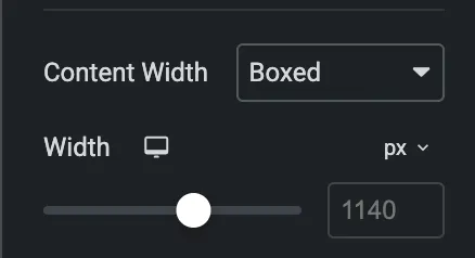
- A Boxed Layout, on the other hand, limits the width of the page content, usually within a container or fixed-width box. The page background typically appears as a solid color or image around the content box, providing a framed, more traditional design.
- Boxed Layouts in Elementor are preferred for websites that aim for a more contained, structured look, often used for corporate or blog websites.
Key Differences Between Full-Width and Boxed Layouts in Elementor Pro
| Feature | Full-Width Layout | Boxed Layout |
| Content Width | Spans the entire width of the browser. | Fixed width with margins on both sides. |
| Common Use Cases | Hero sections, modern websites, landing pages. | Blogs, corporate websites, portfolios. |
| Background Options | Backgrounds can stretch across the entire width. | Backgrounds are confined within the boxed area. |
| Customization Flexibility | Ideal for minimalist, modern designs. | Ideal for more traditional designs, where control over width is needed. |
| Padding & Margin Adjustments | Less margin and padding are typically used to allow the full width effect. | Padding is added around the content to create the boxed effect. |
When to Use Full-Width Layout in Elementor?
- Visual and Creative Websites: If you are designing a portfolio, photography site, or an agency website, a Full-Width Layout can showcase your work in a larger-than-life manner, using visuals to capture attention.
- Landing Pages: For landing pages that need to make a big impact, the Full-Width design can create a clean, bold look.
- E-commerce Sites: A Full-Width Layout can be a great option for online stores where you want to present product images and categories without any constraints, offering a wider view of the offerings.
When to Use Boxed Layout in Elementor?
- Corporate and Business Websites: A Boxed Layout is typically used in corporate, business, and professional sites where the focus is on clean, organized content. It helps maintain a formal and neat look.
- Blogs and News Sites: A Boxed Layout provides a more structured and organized approach, making it easier for visitors to read articles, navigate categories, and stay focused on the content.
- Sites That Need a More Traditional Look: If you’re designing a site with a more classic aesthetic, the Boxed Layout may provide the traditional feel that many users prefer.
Conclusion
Both Full-Width and Boxed Layouts in Elementor offer distinct advantages, and the best option depends on your design goals and the type of website you’re building. The Full-Width Layout is ideal for creative, visually driven websites, while the Boxed Layout is better suited for professional, corporate, or content-heavy sites that require a more contained and organized structure.
Choosing the right layout can significantly impact how your website looks and feels. By understanding the differences between Full-Width and Boxed Layouts in Elementor, you can make a more informed decision and create a design that aligns with your vision and enhances the user experience.
Structural Comparison: Full-Width vs Boxed Architecture
| Criteria | Boxed Container Layout | Full-Width Container Layout |
|---|---|---|
| Container Width | Fixed maximum constraint (e.g. 1200px) | 100% of the browser viewport width (100vw) |
| Ultra-Wide Monitor Rendering | Content remains centered with balanced side margins | Content stretches across 2560px+ unless inner constraints are set |
| Typography Readability | Optimal (60–75 characters per line) | Poor if text stretches edge-to-edge across wide screens |
| Ideal Use Cases | Blog articles, feature cards, pricing tables, checkout forms | Hero sections, background image bands, interactive maps, sponsor ribbons |
The Modern Hybrid Pattern: Full-Width Wrapper with Boxed Content
Professional web designers almost universally use the Full-Bleed Hybrid Pattern:
- Create a parent Container and set Content Width to Full Width (100%). Apply your background color, gradient, or hero photograph to this parent container.
- Inside the parent, add an inner Container and set Content Width to Boxed (1200px).
- Place all headlines, body copy, and buttons inside the boxed inner container.
- This guarantees that background colors stretch seamlessly from edge to edge on 4K monitors, while all vital text and interactive buttons stay perfectly aligned along a disciplined 1200px content grid.
Need disciplined layout architecture, responsive design systems, or bespoke WordPress engineering? Explore our WordPress development solutions at CV World.
Frequently Asked Questions
Ready to Build Professional Websites Faster?
Supercharge your WordPress design workflow with 100+ premium widgets, theme builder capabilities, and dynamic WooCommerce templates.
Click the hamburger menu in the top left of the Elementor panel → Site Settings → Layout → Layout Settings → Container Width (standard default is 1140px or 1200px).
Ensure your page template is set to Elementor Full Width in Page Settings (Gear icon → Page Layout), and verify that parent containers have zero padding.
On screens narrower than 1200px, boxed containers automatically adapt into fluid 100% width layouts with comfortable side padding (typically 16px to 24px).
Yes. Alternating full-width colored sections with boxed content sections creates visual pacing and helps divide content into clear visual milestones.
No. When implemented using modern clean-code standards, responsive Flexbox containers, and server-side caching, your website maintains rapid sub-second loading speeds and easily passes Google Core Web Vitals assessments.
Need Custom Elementor Pro Development or Speed Optimization?
Partner with CV World lead WordPress engineers for custom Theme Builder development, WooCommerce integrations, and guaranteed 90+ Core Web Vitals.